Photography portfolio
Samuel Martínez
Let the work lead.
Design / Desktop & mobile
The work, on screen.
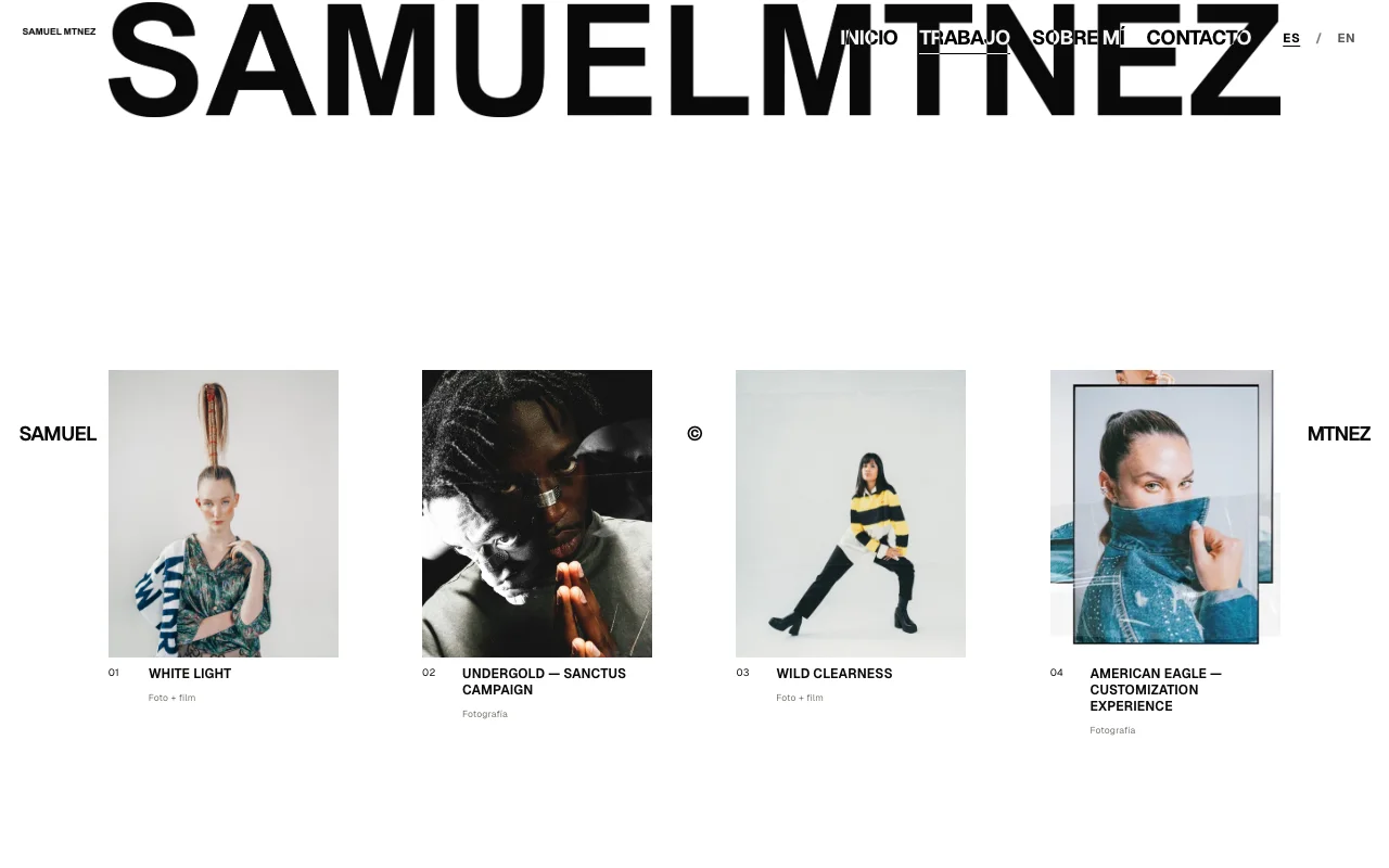
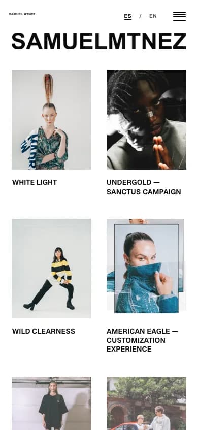
Same intention. A different screen.
01 / The idea
What this needed to solve.
Give photography and film enough presence to be judged on their own, while making the move from a selection to an individual project feel straightforward.
Portraits, wide photographs and films do not fit one uniform frame. The interface needed a consistent rhythm without flattening their different proportions or loading every project at once.
02 / The process
How it took shape.
- 01
Edit the selection
Organized the supplied photography and film into project collections, choosing covers and an order that introduce the work before the interface.
- 02
Respect the image
Composed portrait and landscape work with their own proportions, then added gallery and detail views without changing the photographic framing.
- 03
Separate the media
Used ImageKit for responsive photographs and covers, and YouTube for full films, adapting the presentation to each medium rather than treating them as interchangeable files.
- 04
Publish the reading experience
Built the public portfolio as a static, bilingual website and refined project navigation across desktop and mobile. Editorial administration remained separate from the public release.
The system / Information architecture
One project, different media
A project connects its cover, photographic sequence and film through one editorial record. The public website presents the work; it does not expose the private editing workflow.
Project story
Selection, sequence, context and credits form one readable collection.
Photography
ImageKit serves web-sized photographs and covers in their intended proportions.
Film
Full films are presented through YouTube with their own viewing experience.
Scope / Craft
My contribution.
What I worked on
- Web design
- Website implementation
- Next.js
- React
- TypeScript
Built & designed
- A responsive, bilingual portfolio with a visual project index and individual stories.
- Image presentation that preserves each photograph’s proportions and supports closer inspection.
- A public static website with photographs in ImageKit and full films in YouTube.
Website design and implementation by Santiago Quiceno. Photography and the featured productions are credited to Samuel Martínez and their respective collaborators.
Explore the live website (opens in a new tab)