Hierarchy before style
The reader always knows where they are and what deserves attention.
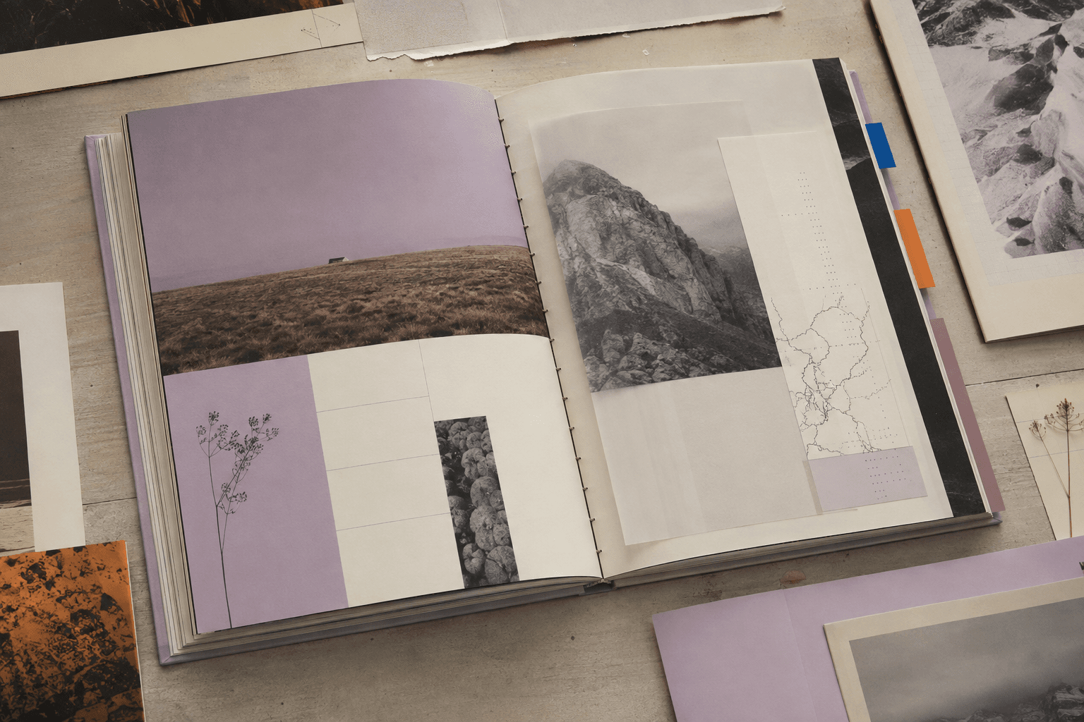
Dense information, made human.
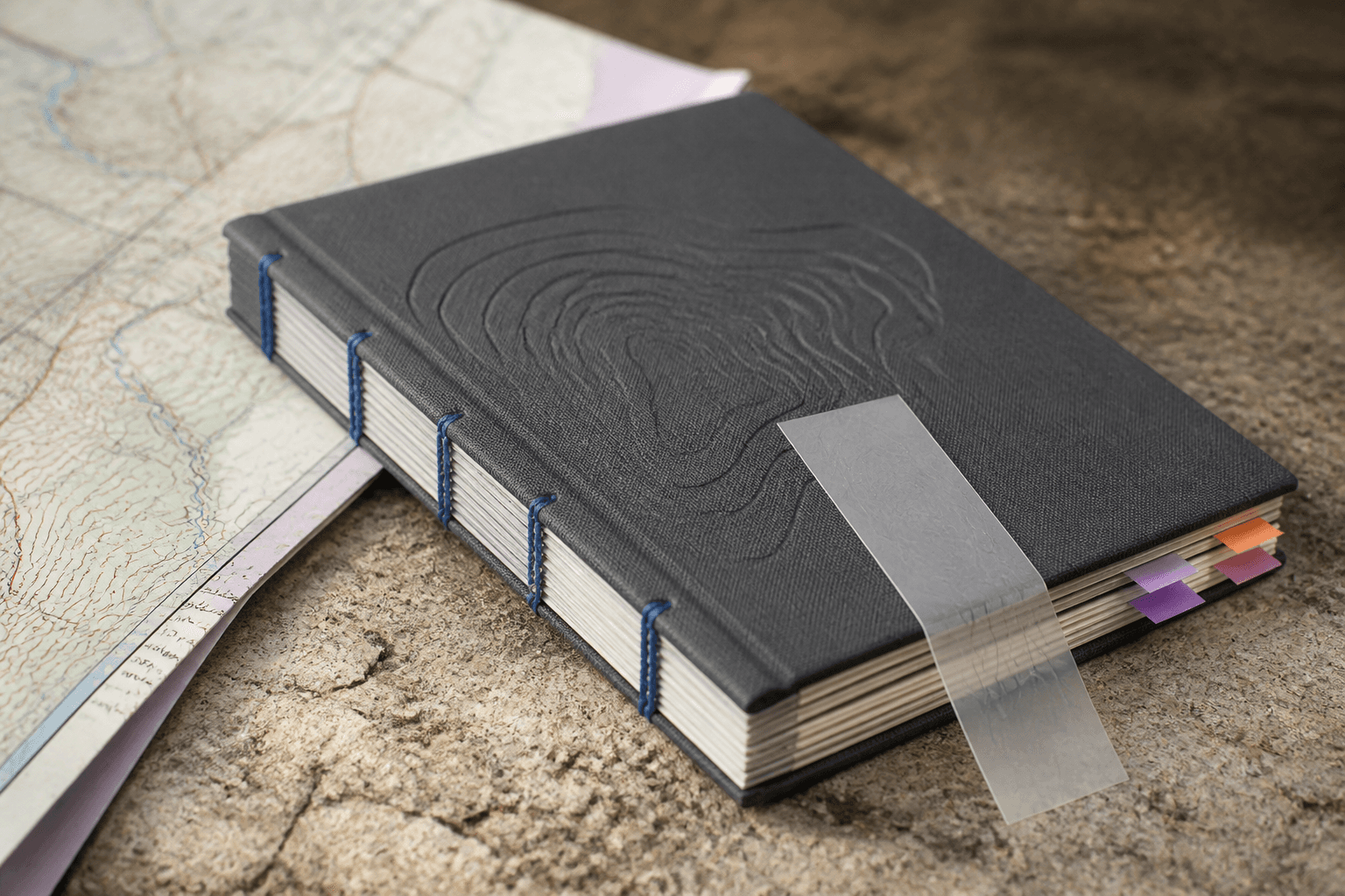
Use a durable grid, quiet typography and tactile navigation so every layer—from a photograph to an index tab—helps the reader think.
Use a durable grid, quiet typography and tactile navigation so every layer—from a photograph to an index tab—helps the reader think.
Page families shift density and pace while the reader always understands hierarchy, sequence and place.
Research-heavy publications can feel either beautiful or useful. The real task is to make them both without simplifying the ideas.
Use a durable grid, quiet typography and tactile navigation so every layer—from a photograph to an index tab—helps the reader think.
The reader always knows where they are and what deserves attention.
Paper, inserts and binding make research feel collected over time.
Page families change pace without losing the publication’s logic.
The digital edition keeps the reading rhythm rather than imitating paper.
Art-directed conceptual imagery created for this portfolio study. Not a client claim.